Smart Quotes and Apostrophes
James Stratford
I'm going to level with you now; this is going to be a geeky post but you might learn something pretty surprising about typing. I know I did.
One of my favourite typefaces is Adobe Song (Adobe Minion but a little lighter and looser, designed for simplified Chinese). There'll be those that say I probably shouldn't use it for latin text but I just like how it looks. I often set Apple Pages to this typeface when I want to just type. I set song lyrics and poems in this typeface regularly. A problem I've had with using Adobe Song has long been an inexplicable space after apostrophes.
Adobe Song and the apostrophe mystery
Needless to say this drove me crazy. I tried the obvious: highlighting the space to see if it could be manually deleted, playing with tracking and kerning, you name it. Nothing seemed to sort this out.
I ran a web search for this problem and the plot thickened. I discovered plenty of people complaining about something similar, but they were using Microsoft Word, not Apple's Pages. I opened Photoshop and tried to type with Adobe Song there and discovered that there too I got this irritating space. Three different applications across different operating systems and the same problem. That told me this probably wasn't a bug but something I didn't know about typefaces that was tripping me up.
Quotation Mark Ignorance
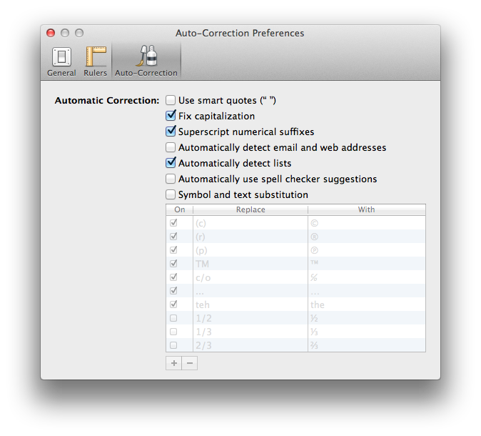
To cut a long story short, I discovered that almost all of us type the wrong (for want of a better word, as I'll explain) character when we are typing apostrophes and quotation marks. As so many of us are typography laymen, Microsoft and Apple have a setting in their word processors for enabling ‘smart quotes’ that automatically corrects for our ignorance. This setting is enabled by default and most of us will never even notice.
Pages' smart quotes
What does this setting do? It automatically substitutes the ' character for a nice curly ’. You see, they are not the same character.
An imaginary headline set in Times New Roman. Note that using the correct keyboard key for an apostrophe here is rendered as a symmetrical typewriter apostrophe when smart quotes is disabled.
Back when typewriters were the word processor of choice, it simply wasn't practical to have a key for all these different yet similar punctuation marks. It became acceptable to use ‘dumb quotes’ when using a typewriter. The apostrophe, single quotation mark and prime symbol were all entered using the same key and a symmetrical ' was invented for simplicity's sake. You'll still often see this character online, where text has been entered using programs without a ‘smart quotes’ feature (including for apostrophes in the body of this article, typed online. Safari has a ‘smart quotes’ feature but it doesn't seem to affect this web app).
When computers took the place of typewriters people's habits were set hard and so for the sake of typography the ‘smart quotes’ feature was widely adopted by software companies. Usually, this feature works fine and substitutes in curly quotation marks when we use the key left over from typewriter days and we hardly notice – so much so that when it goes wrong as it did for me using my Adobe Song, I was at a loss to know what had happened!
What was happening was that I was entering apostrophes and Apple Pages was substituting the apostrophes with a quotation mark, as is its wont. When the quotation mark went in, so did the added space that should follow a quotation mark. Of course, I wanted an apostrophe, which does not mandate a space.
Apostrophes, Quotation Marks and Primes
So what should we be typing in for quotation marks if we don't want to rely on smart quotes? Well, there are three main characters that you're likely to be typing in using the same character on your keyboard: apostrophes, quotation marks and primes.
For an apostrophe, you're almost certainly already using the correct character. On my Mac's keyboard it's the key to the right of the colon/semi-colon key. The issue with apostrophes is that using the correct character on your keyboard for an apostrophe will likely give you a typewriter apostrophe rather than a nice curly one, as I said earlier. This is why smart quotes generally substitutes this apostrophe with a closing curly single quote.
For a quotation mark, you should be typing option-] to for open marks and option-shift-] for closing ones.
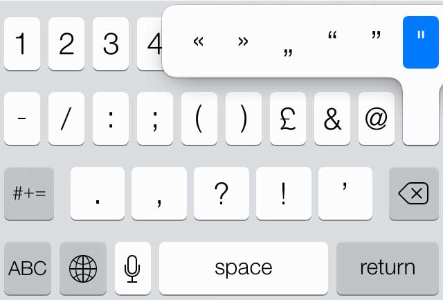
The symbols keyboard in iOS 7 is labelled with a closing double quotation mark/speech mark but the default symbol you actually get is a double prime.
A prime is the mark used to signify feet and minutes, amongst other things. To enter this character, you will probably have to use your Mac's Special Characters window accessed from the edit menu in most apps. ‘Smart quotes’ won't do this for you so it's good to know you shouldn't use the apostrophe key for this at all ideally.
If you are using an iOS device then you can get these symbols by pressing and holding the characters on the virtual keyboard. Bizarrely, the typewriter double quotation mark key is labelled with curly double quotation marks/speech marks. iOS supports primes but I cannot see any way to enter them using the keyboard.
What About Speech Marks/Double Quotes?
Typewriter quotes and opening and closing speech marks/double quotes in Times New Roman
The same story, I'm afraid, but with some confusing US nomenclature thrown in for good measure. You see, I've said ‘quotation mark’ throughout this article referring to the single quotation mark. I'm British, and in Britain this is what a quotation mark is. The double quotation mark is a ‘speech mark.’ I'm sure not all Brits will agree, but those same Brits probably say ‘alternate’ instead of ‘alternative’!
Regardless, the symbol you get if you press shift-' is an old typewriter double quotation mark. Again, it'll often get automatically converted to a nice pretty curly double quotation mark if you have smart quotes on, but if you want to know the shortcut for entering this manually it's option-[ for opening marks and option-shift-[ for closing.
Does It Matter?
If you have smart quotes on – and you likely do – then it probably doesn't matter as your word processor will handle this for you most of the time. Unfortunately, the smart quotes feature isn't perfect and if you love your type as much as I do then you want to know your beautiful curly quotes from your typewriter throwbacks. Great type is about the details. It's also just nice to know what you're doing and not have to rely on your computer to correct you. Of course, the likelihood is that nobody will notice if you just use dumb quotes, but I'd like to think my audience would be made up of the type of people that would care!
…but I digress.


